When Kelsey and Collin Kelly approached me with their idea of a coffee start-up, I was as excited to get to work and build their brand from the ground up. We hopped on an introductory Zoom call and talked all things Elkhorn Coffee Co.. What their vision was, who their audience was, as well as how they saw their company in terms of aesthetics, look and feel.
Then I got to work. Phase 1 of my process, is to do a market research and look at their competitors, as well as what's out there in the market. They expressed interest in having a logo mark that has something to do with a deer/elk, antlers, or an ornated letter "E." In addition to my research, I put together some styles pages to gauge better their preferences for visual style for the mark, as well as the font choice in the type treatment. I also threw in there a page with some ideas for packaging, again to see what they'll feel comfortable with.
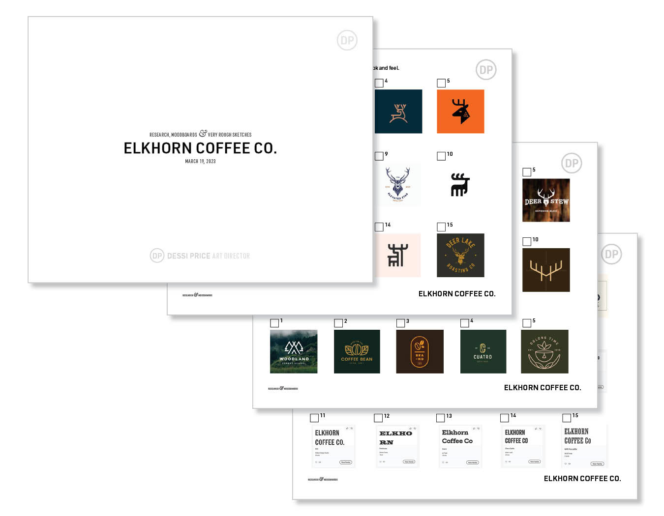
I also created mood boards for them with 3 distinctive looks based on our conversation. Option 1 had Western more textured look, while Option 2 was clean and modern, and Option 3 had retro/vintage look.
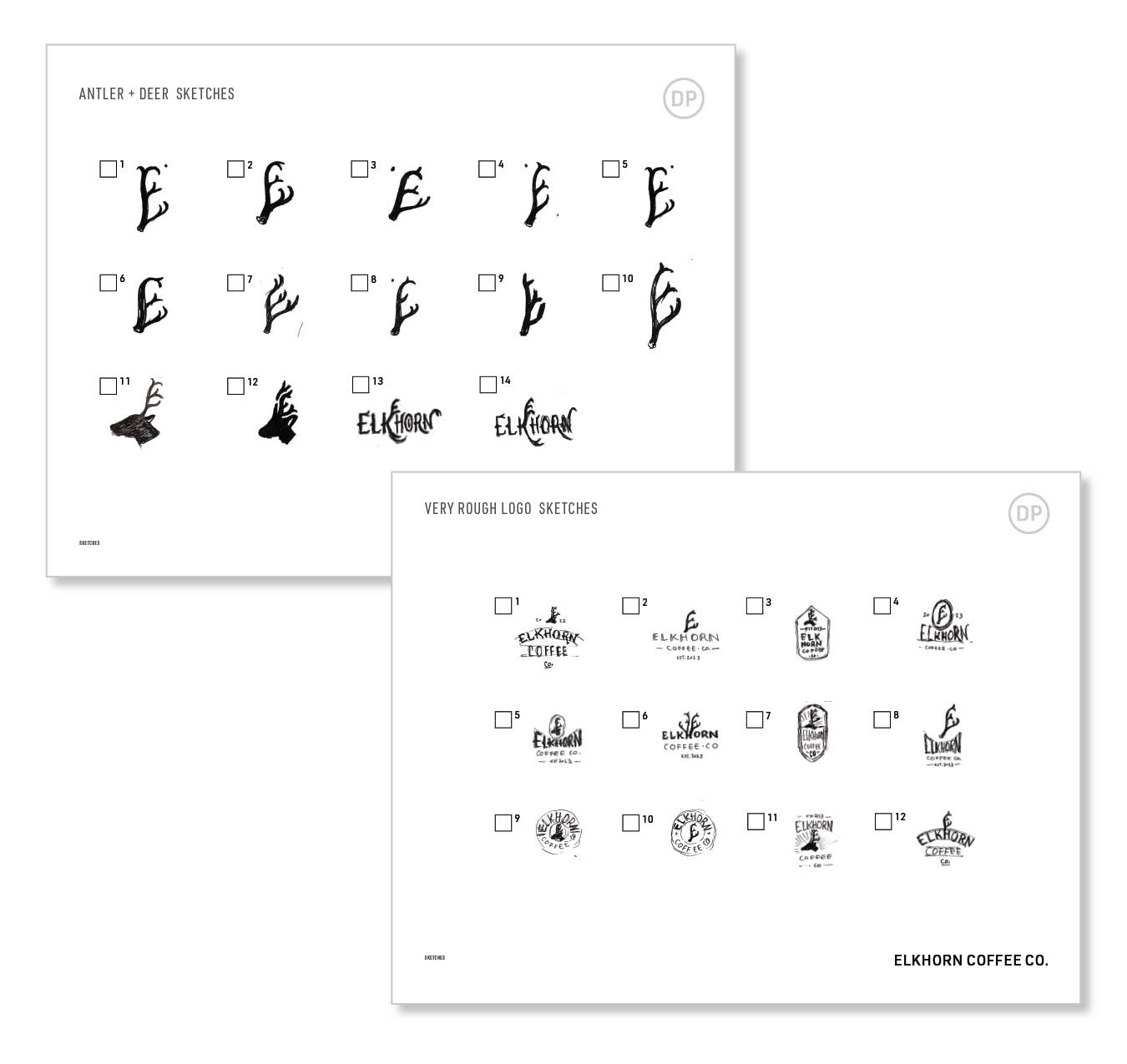
And last but not least i provided them with a couple of super rough sketches for the deer head with an antler shaped in the letter "e" ,as well as different antler options that looked like the letter "e"
They reviewed the style pages and selected their favorites, and picked two of the moodboards to merge into one since one of them liked the clean look of option 2 but the other one really liked the more poppy and vibrant color palette of option 3.
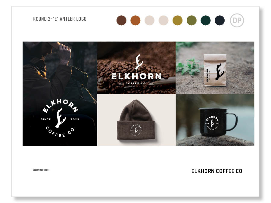
At this point, I have everything i need to lock myself in a room and start dreaming up the perfect brand for my client. I created 4 different identities for them based on their style picks from the previous exercise. Then took those marks and applied them over different images to bring the identity to life, so they can envision their logo on products and merchandise.
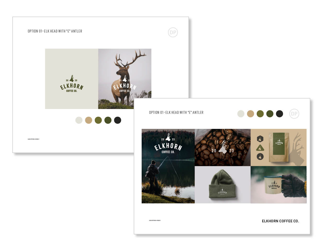
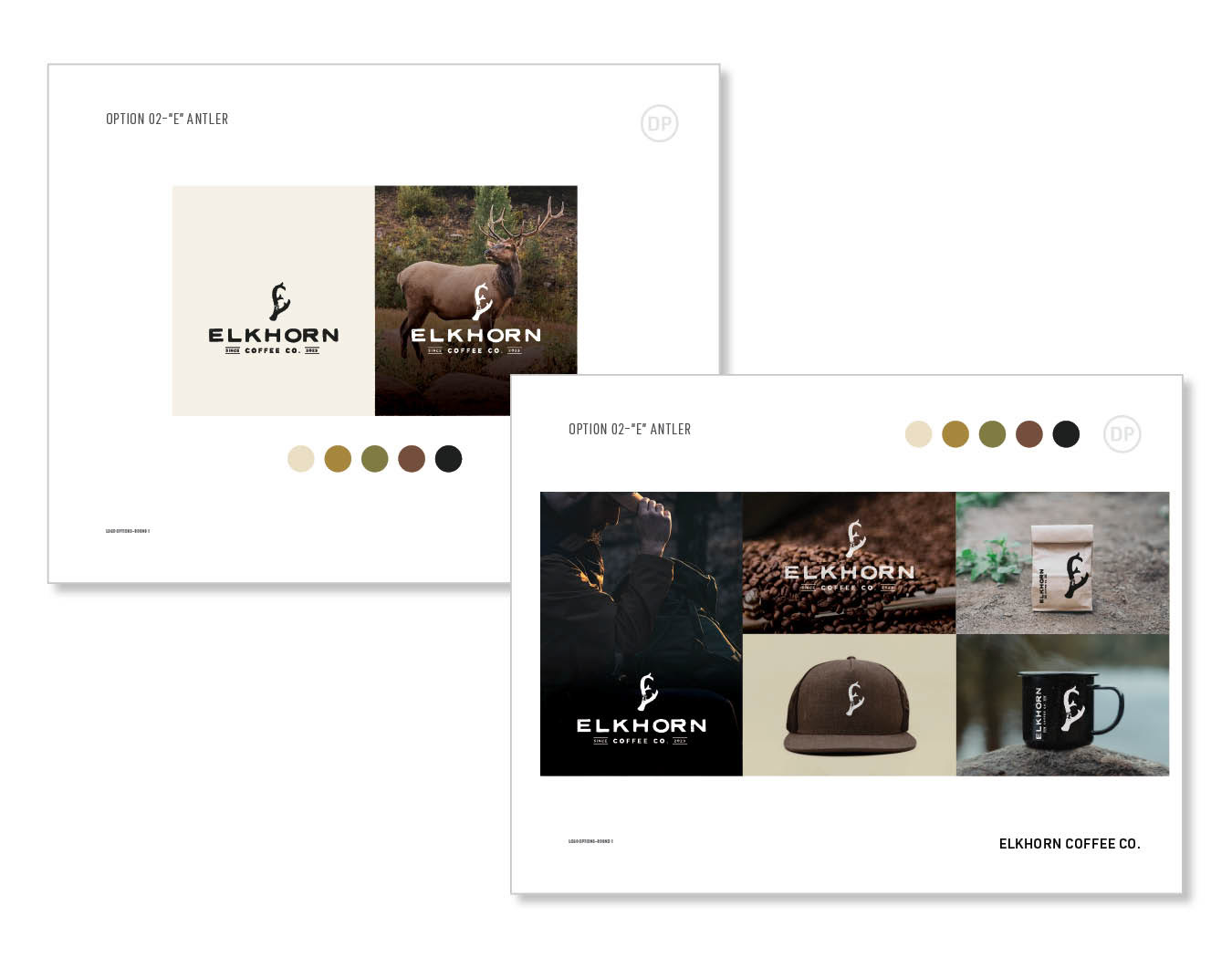
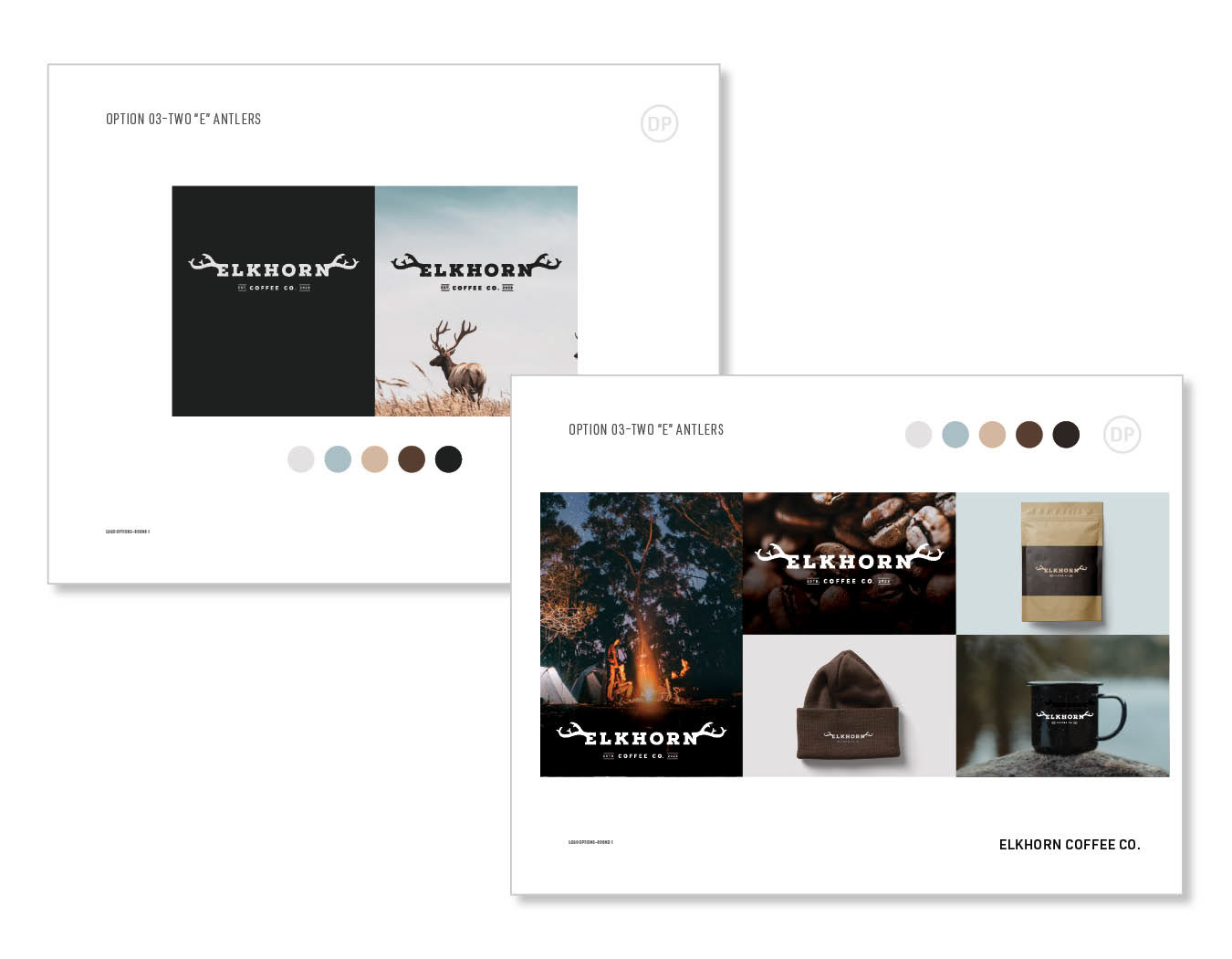
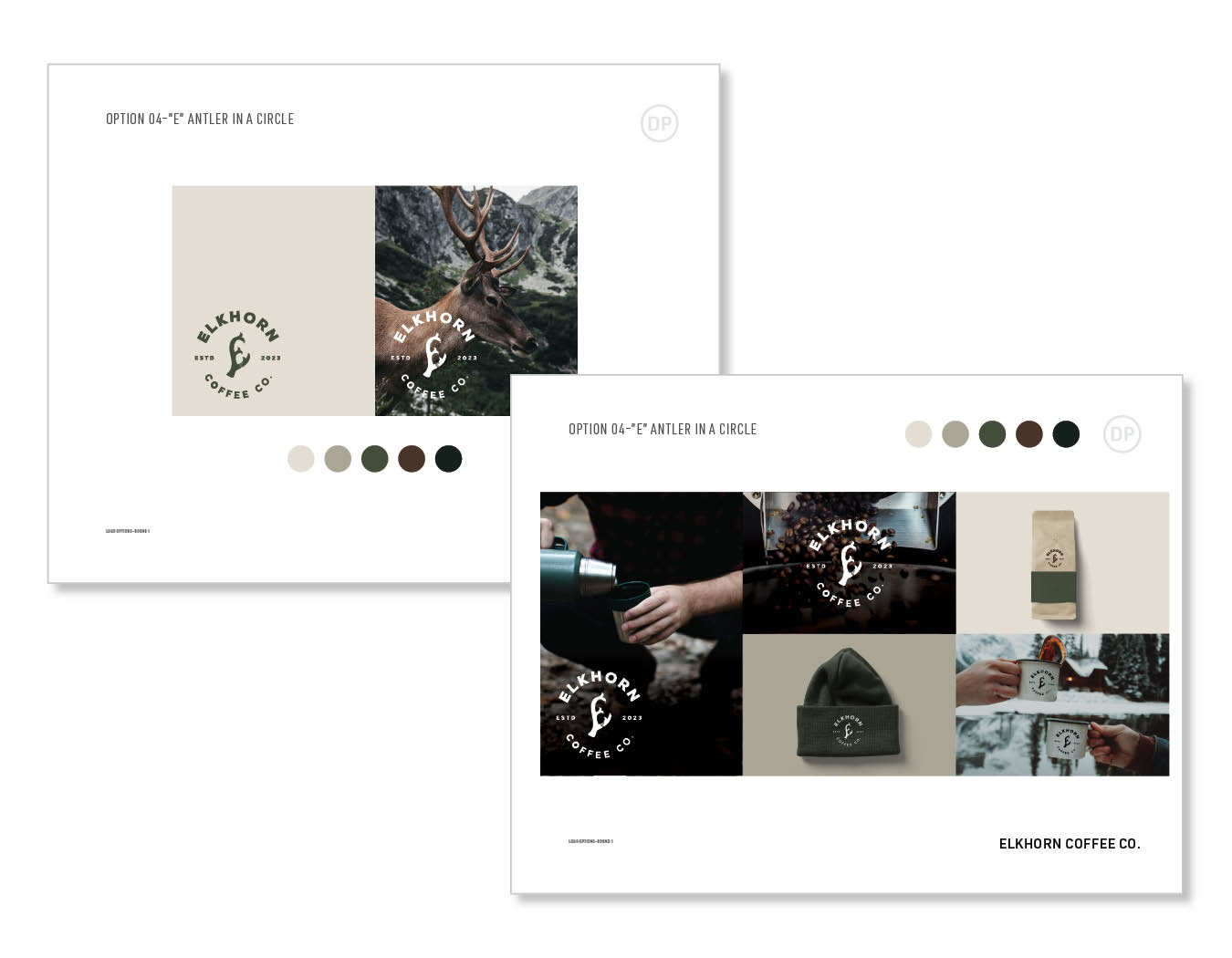
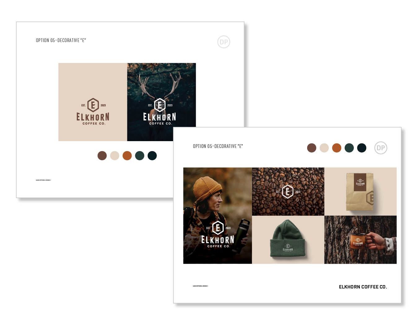
At the end of the presentation I created a summary slide, so they can see all of the options on one page and we can go over each one of them and see which one they are leaning towards.
Can you guess which one they picked?
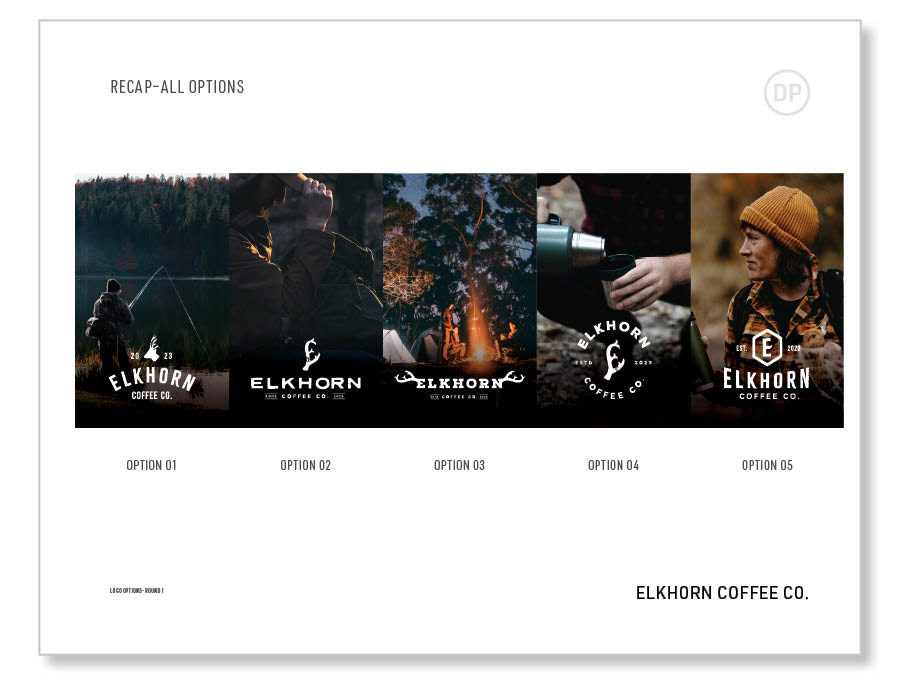
So they wanted to see Option 02 and 04 with a couple of antler options before picking the final one.
Check out their Instagram to see the final pick :)
I had so much fun working on this project. This is pretty much what i live for, branding and anything food-related to promote.
Mockup images are sourced from Unsplash and Mr. Mockup.
Style pages and mood boards use images from the internet with the sole purpose to get a feel for the client's style preferences.