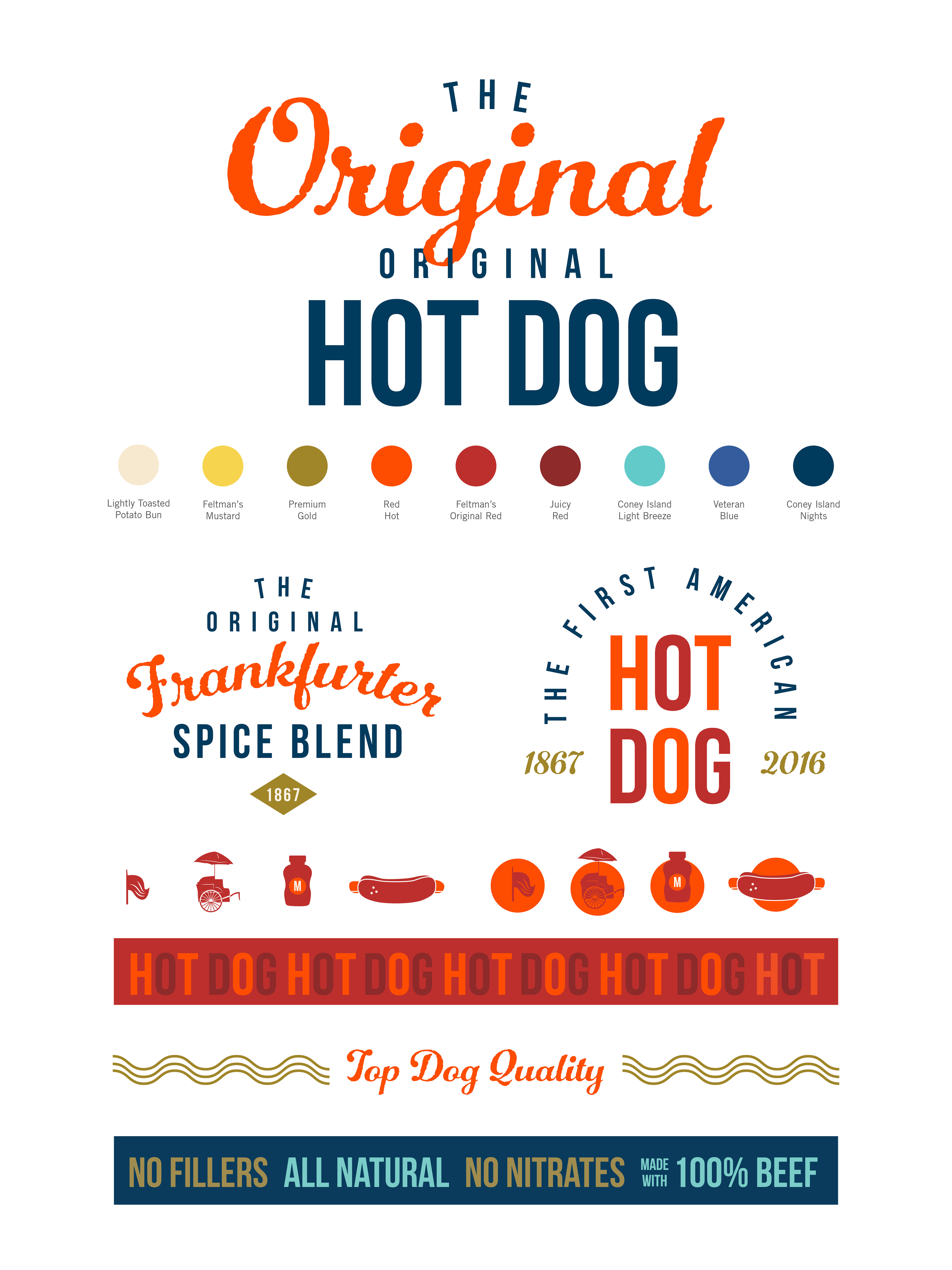
We were tasked with creating a brand refresh for Feltman’s of Coney island, a hot dog company that brought back the boardwalk favorite – original hot dog recipe. No fillers, all natural, no nitrates, made with 100% beef. The Original, Original Hot Dog.
To modernize and elevate a classic (and bring some nostalgic feel) new fonts, colors, icons and additional design elements were introduced to the brand. The script font and gold color are used to support the “high quality” and higher price point per dog. Fun new patterns were created to refresh the brand and infuse vibrancy. The dual usage of Red Hot and Feltman’s Original Red colors creates a festive look and represents the Coney Island Red Hots.
A fun, vibrant pattern has been created out of the repeating words HOT and DOG, as well as curvy mustard lines representing the famous house-made Feltman’s mustard.
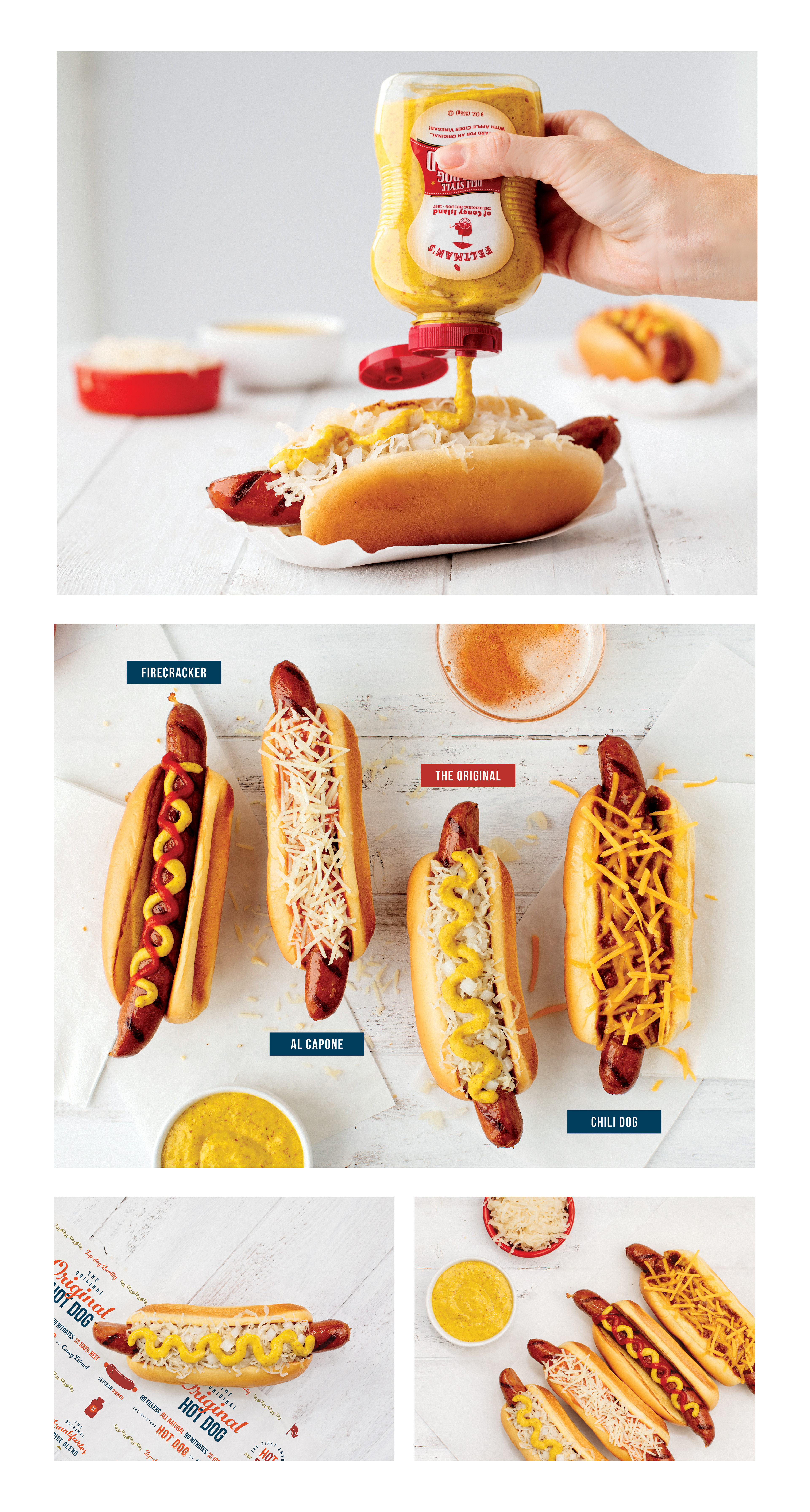
A new photography style was introduced to appeal to the new audience—FOODIES interested in higher quality gourmet food experiences. The new photos are foodie-focused turning the hot dog into the main star, and conveying the idea of gourmet and appetizing. They are clean, light and vibrant. The wood references nature, as well as the idea of the boardwalk on Coney Island.
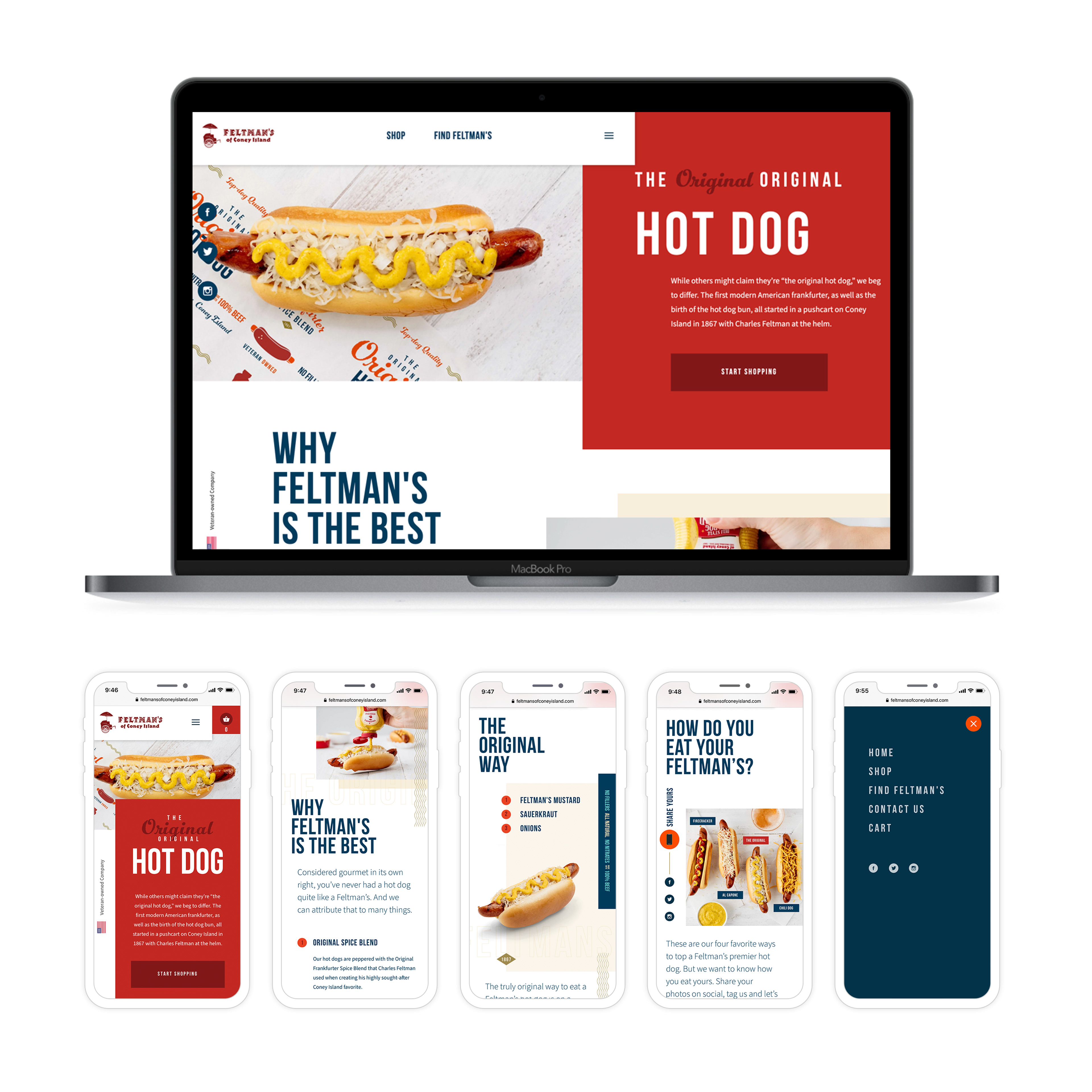
The website was also updated and redesigned with new brand elements and photography style. The e-commerce buying process was streamlined and simplified based on UX Audit of their previous site. The customer now knows what exactly they are buying, how many items, and when the shipment will be arriving, which lowered confusion and cart abandonment significantly. The ease and simplicity were translated to the mobile version of the site as well with its responsive nature. See website redesign here.
Work done while working at Bozell:
CD: Dan Cooper
AD/Brand Design: Dessi Price
Copy: Kerrey Lubbe
Web Design: Justin Henriksen
Web Development: Brad Douglas
Production: Antonio Torrez
Project Management: Danny Wikowsky, Christine Dunn
AD/Brand Design: Dessi Price
Copy: Kerrey Lubbe
Web Design: Justin Henriksen
Web Development: Brad Douglas
Production: Antonio Torrez
Project Management: Danny Wikowsky, Christine Dunn
Photography: Dana Damewood
Food Styling: Megan Shea