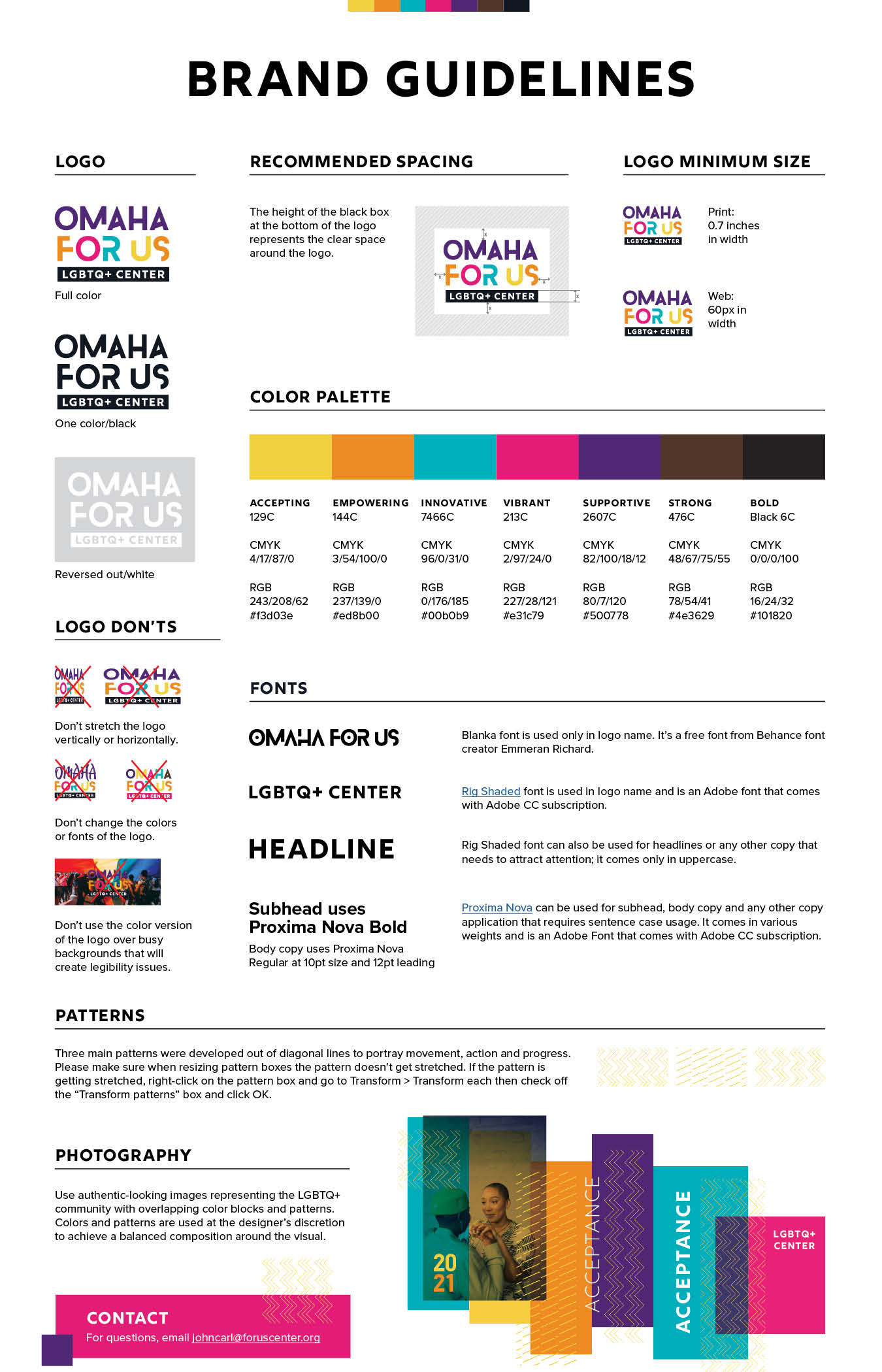
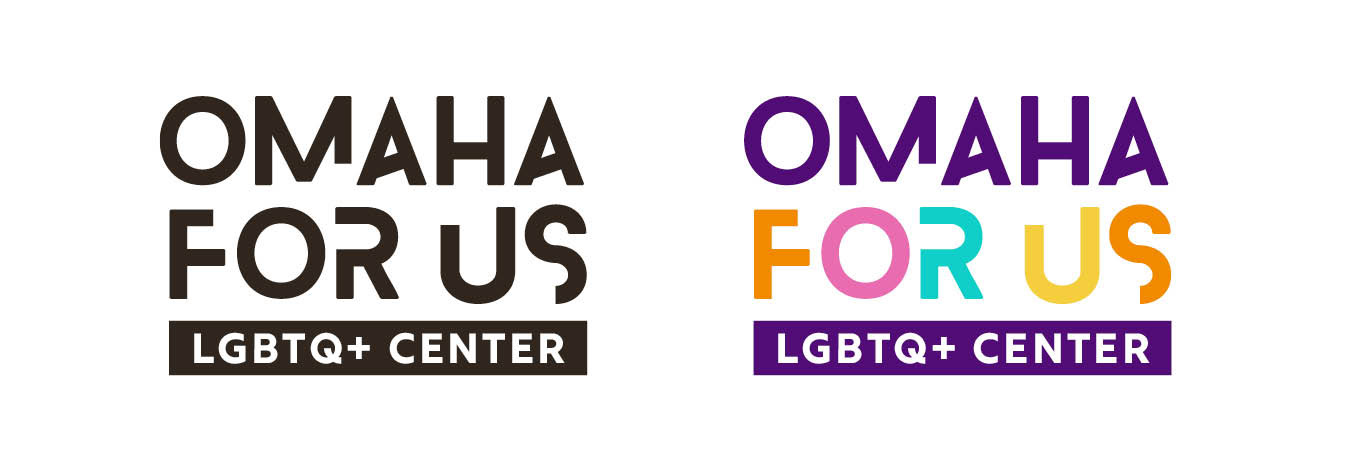
Omaha For Us came to Bozell for a brand refresh after their name change from For Us LGBTQ+ Center to Omaha for Us LGBTQ+ Center. They wanted the new identity to be bold but warm and inviting and accepting of everyone. They requested the use of the Blanka font to connect to their old name but requested additional brand elements to be added.
As usual, we started the process with research and analysis of similar organizations around the country and came up with two different mood boards for them to choose from. One was bold and empowering, and the other was bright and inviting and accepting of all.
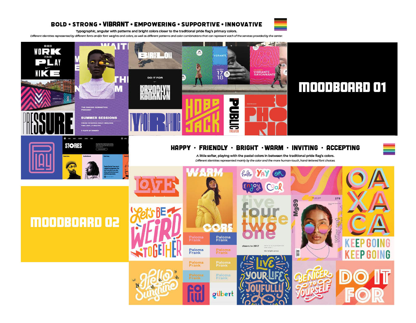
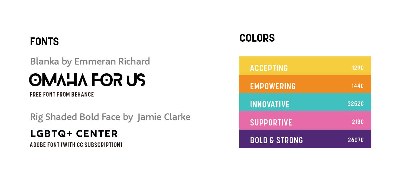
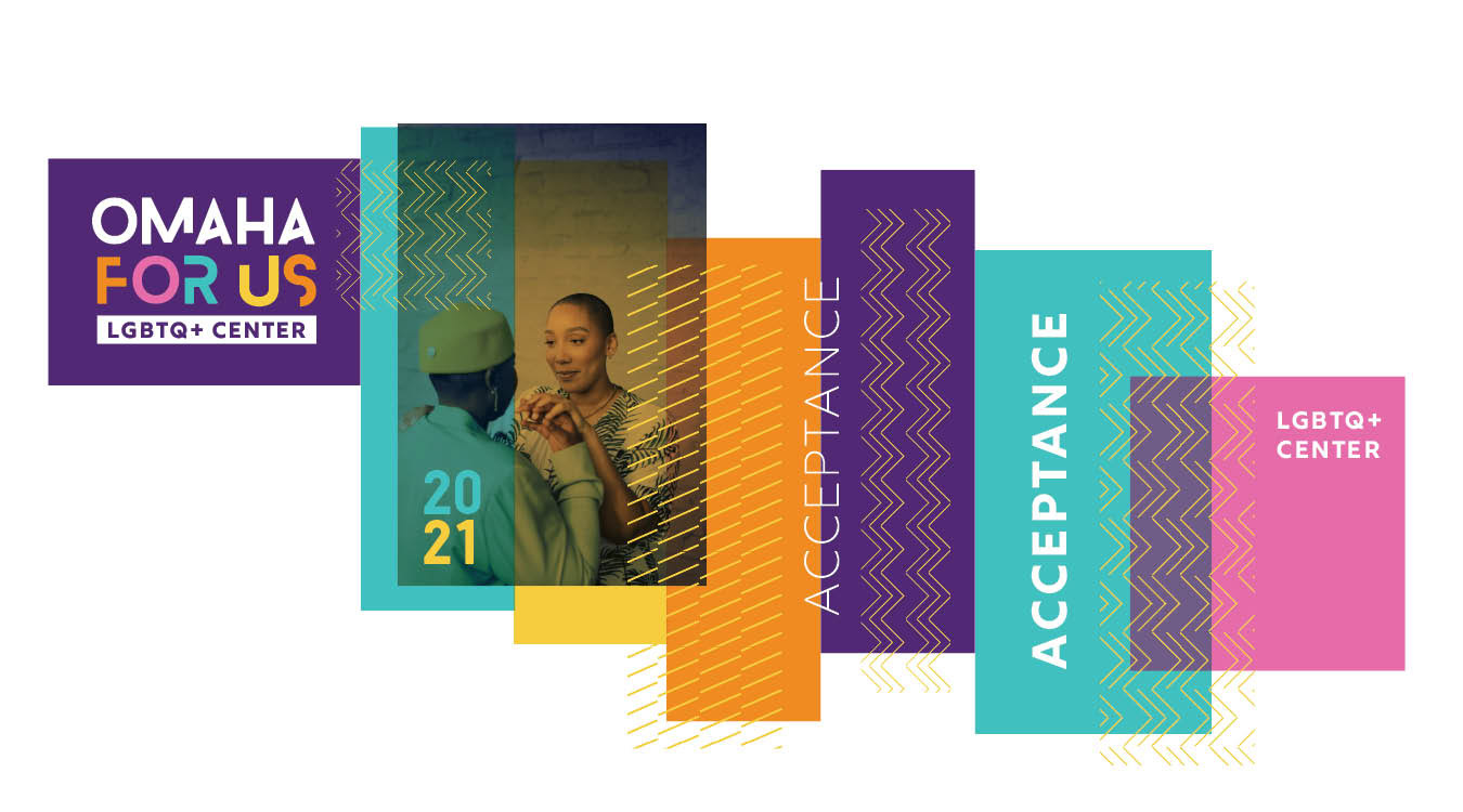
The client picked the bold one, so we proceeded with choosing fonts to add to the bold and empowering look we were going for, as well as elaborated on the rainbow color palette and gave each color a name and a meaning.
In addition, we added some type treatments and a few patterns to overlay with different colors next to images from their photo library.
Once new brand, look and feel were approved we created a brand standards guide for them to follow when creating branding materials.