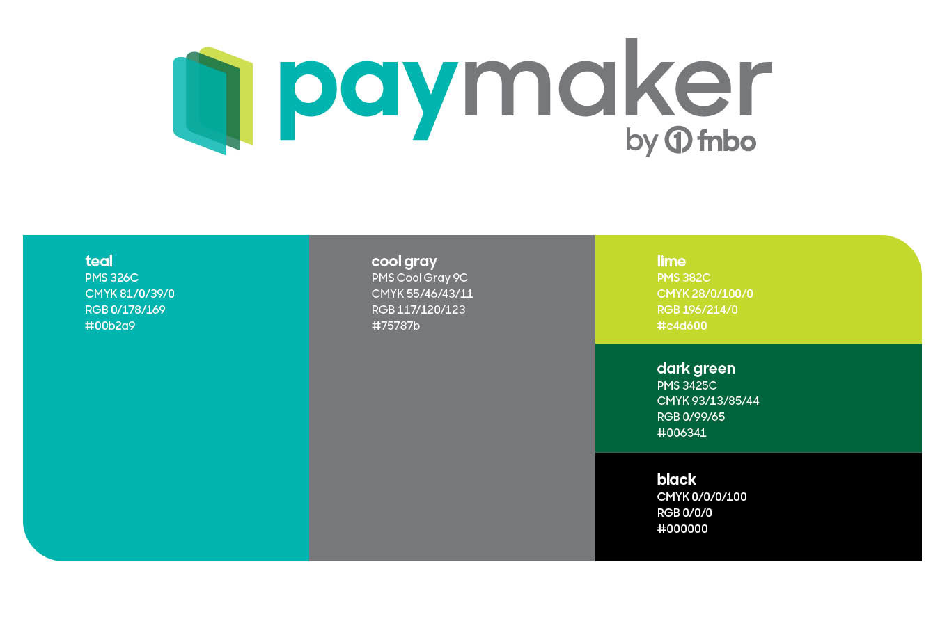
New identity and style guide were created for a cloud-based payments product by fnbo. The identity followed a per-existent typographic structure for all products by the financial institution. New logo mark with a fresh color palette represented the innovation and technology utilized in the creation of this product. The icon is created by three transparent folders coming together to emphasize the visibility and organization of the new payment solution product that provides greater visibility into accounts payable and receivable.
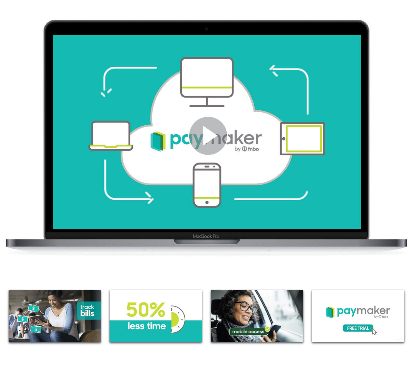
An explainer animated video was created to showcase the benefits and working of the new payments product. The video combined illustrations and business photography overlaid with motion graphics to demonstrate the benefits of using the product both for the client and their accounting firm.
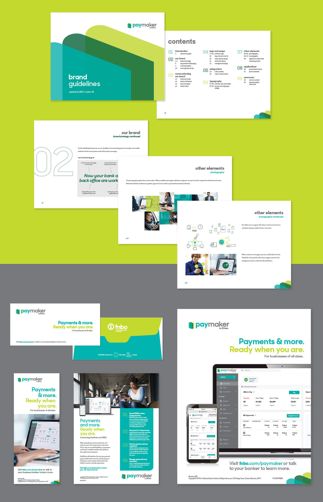
Detailed style guide was designed to give direction on how to use the brand identity, what to do and what not to do with the logo, fonts, colors, icons and photography.
In addition, more materials were produced to inform business clients about the new offering when visiting a branch, such as drive thru posters, bill envelopes, one pagers, and teller handouts.
Work created while at Bozell
CD: Tim Young
AD: Dessi Price
Copy: John Vogel
Video animation: Kyle Theobold
Print Production: Antonio Torrez
Project Management: Ann Marie Schulze, Tom Jarvis
AD: Dessi Price
Copy: John Vogel
Video animation: Kyle Theobold
Print Production: Antonio Torrez
Project Management: Ann Marie Schulze, Tom Jarvis