Sioux Honey Association Co-Op needed a logo refresh in the preparation for their 100th year anniversary. They decided to change the name slightly and add "A Beekeeper-Owned Co-op" to it to better convey the story of their organization. Believing that "One bee can't do it all, neither can one farmer," five humble beekeepers from Sioux City, Iowa, started a co-op in 1921 in the hopes of being able to share equipment and resources and bring more honey to the market. Since then many more had joined to work together and bring one of the best high quality natural grandma-approved honey on the market.
The new logo consists of a friendly slab serif font with artisanal and craft feel and a simple bee in flight symbol that doubles as a blooming snowdrop flower, one of bees' favorite flowers in early spring. The color palette was slightly updated too from what they had before by providing a bolder dark brown and a brighter and more saturated yellow to represent the colors of the bee, as well as the sun and nature in the color of tree bark.
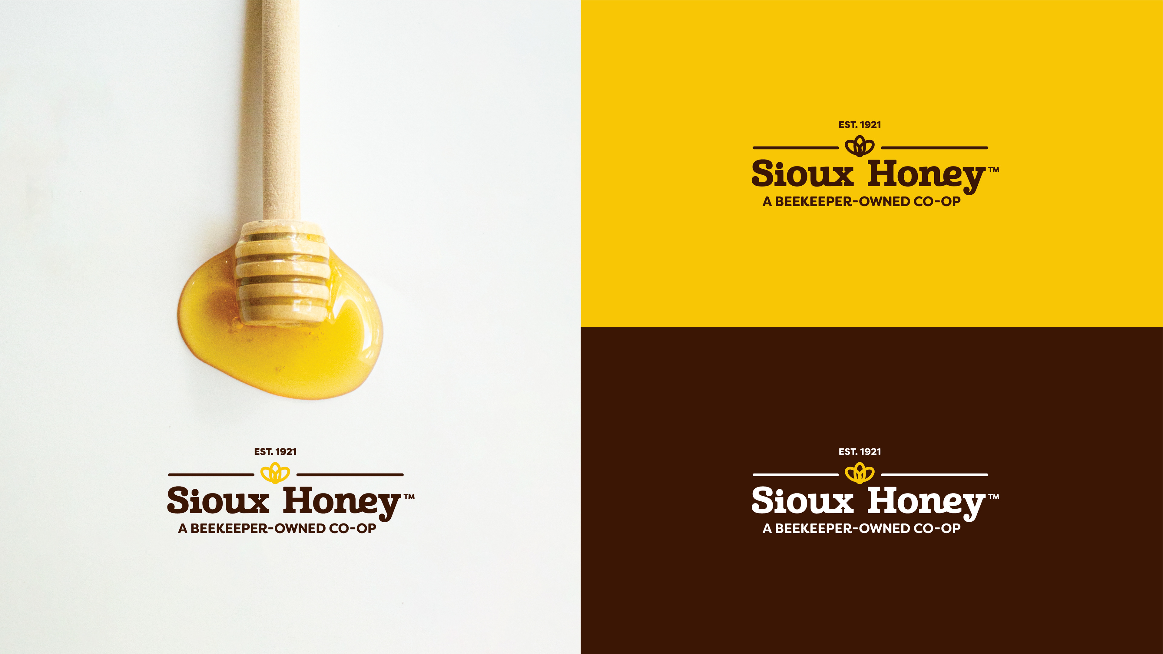
Here are a couple of examples what the logo can look like on swag and merchandise.

Work done at Bozell:
CD: Dan Cooper
Art Director: Dessi Price
AE: Lauren Hartung